
Physical AI - Enterprise for InOrbit
A redesign of InOrbit’s robot fleet management platform, built to serve warehouses running a handful of robots and enterprise operators running hundreds, in six months flat.
RoboOps
UX/UI & Branding
Business Challenge
InOrbit needed to transform from an engineer-built prototype into an enterprise-ready platform.
Targeting Fortune 500 with enterprise-grade design
In 2018, InOrbit’s physical AI fleet management platform was functionally sound but visually inconsistent and built entirely without design input. With a fixed six-month deadline before a major industry event and enterprise deals like Amazon on the line, I was brought in to redesign the full platform UI, branding, and supporting materials.

The interface had to serve 5 and 500 robots with equal clarity.
Competitive analysis showed rival platforms were dense, engineer-built maps with undifferentiated visual weight where error states were nearly impossible to spot. Research confirmed operators needed full-fleet situational awareness in one screen, with any individual robot’s data reachable in two clicks or fewer - a hard requirement the existing interface violated repeatedly.


The Use Cases
Where and How InOrbit Works in the Real World

With personas defined, the next step was grounding the design in a concrete operational context. The diagram below maps a real-world deployment scenario: Bossanova Robotics' inventory management robots operating across Walmart store locations nationwide, monitored and managed through InOrbit's platform.
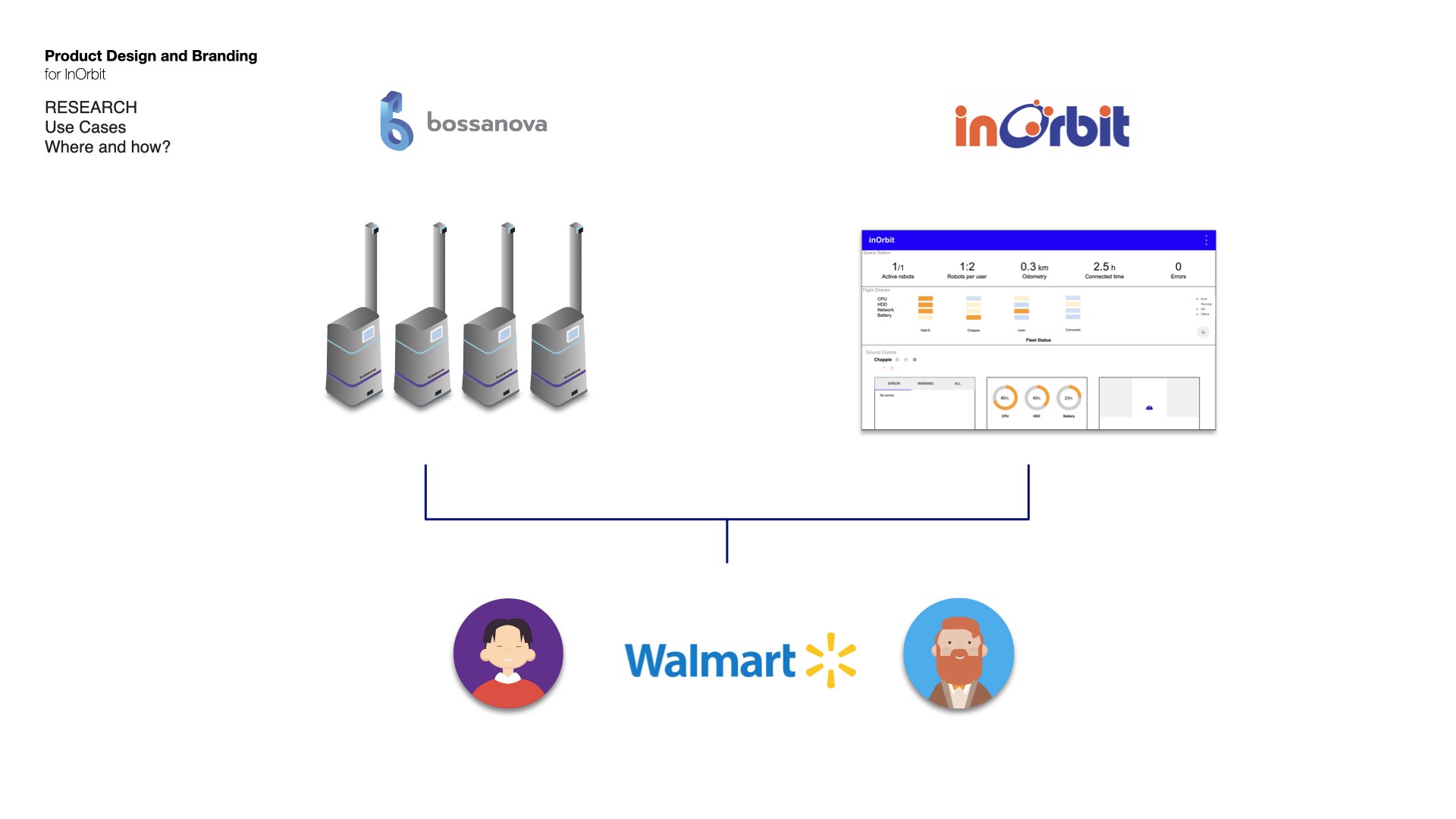
This use case drove several critical design decisions. Teddie, the Operator, is on a 24 desktop screen monitoring the fleet in real time from a central location. He needs immediate situational awareness and fast access to error states. James, the VP of Engineering, is moving between Walmart locations on a laptop. He needs high-level fleet health at a glance, with enough detail to make operational decisions without being in the room.
Two personas. Same platform. Completely different contexts, screen sizes, and information needs, all served by a single responsive interface designed to scale from one robot to hundreds without changing the mental model for either user.
Three-Tier Architecture
The most critical UX challenge in fleet management at scale isn't displaying hundreds of robots; it's making sure an operator can identify a problem robot in under three seconds, regardless of fleet size.
A collapsible three-tier system that includes: General Overview, Fleet Status, and Details - on a modular grid built on Material Design, plus a priority-sorting algorithm reorganized the interface around urgency.

A priority-sorting algorithm continuously reordered robots left to right by urgency, so errors anchored the left edge and healthy robots scrolled off-screen as the fleet grew, keeping operators focused on what actually needed attention.
The result is a self-organizing interface: the most critical information is always visible without scrolling, while healthy robots, which require no operator attention, naturally disappear from view as the fleet grows. An operator managing 500 robots sees exactly what demands their attention, nothing more.
This was one of the most impactful UX decisions of the project: a pattern that turned an overwhelming data problem into an ambient, at-a-glance awareness system.

I rebuilt the dashboard around a modular grid system, standardized proportions, sizes, and color tokens that could scale from 5 robots to hundreds without breaking the layout or losing operator clarity. The dark mode wasn't just aesthetic: it served a functional purpose, reducing eye strain for operators monitoring screens for extended periods and giving critical error states higher visual contrast.

Comparing BEFORE and AFTER


Funding & Impact
The redesign directly enabled a $2.6M Seed.
Shortly after launch, InOrbit closed their Seed round followed by a $10M Series A.


FAQ

